Yamaha Vai de Boa
Brand Identity I Typography
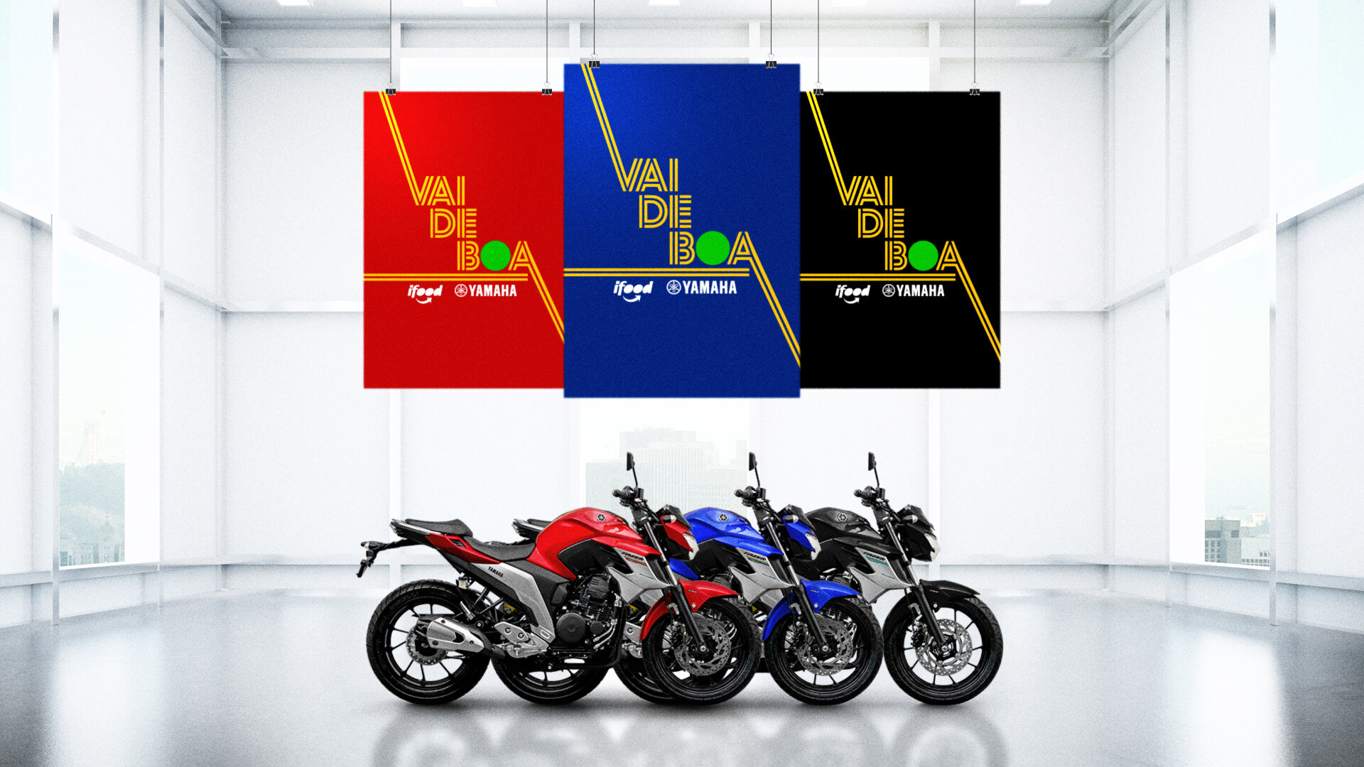
Yamaha and iFood (the largest food delivery service in Brazil) joined forces to create a educational program to help their motorcyclists drive safely.
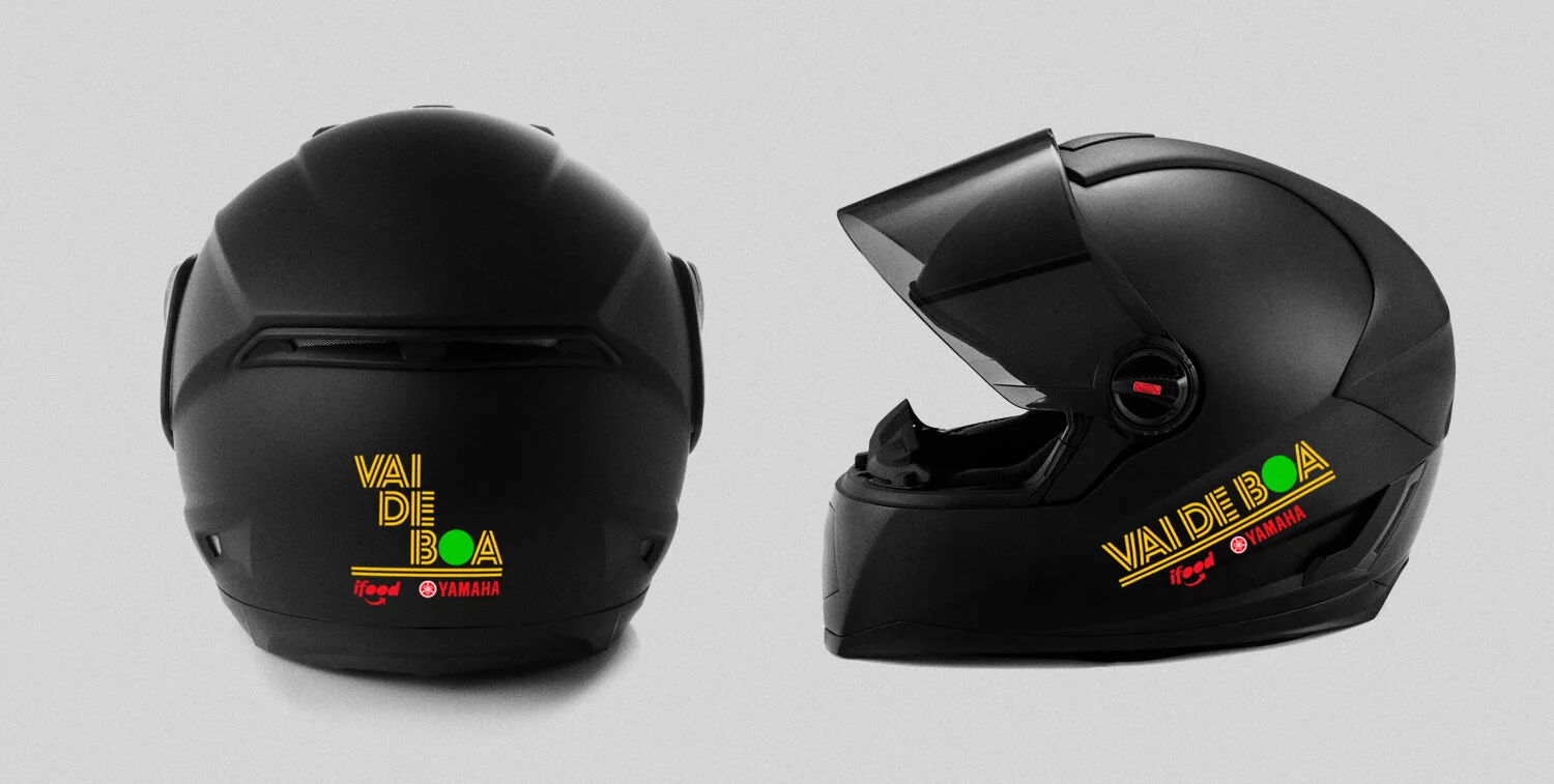
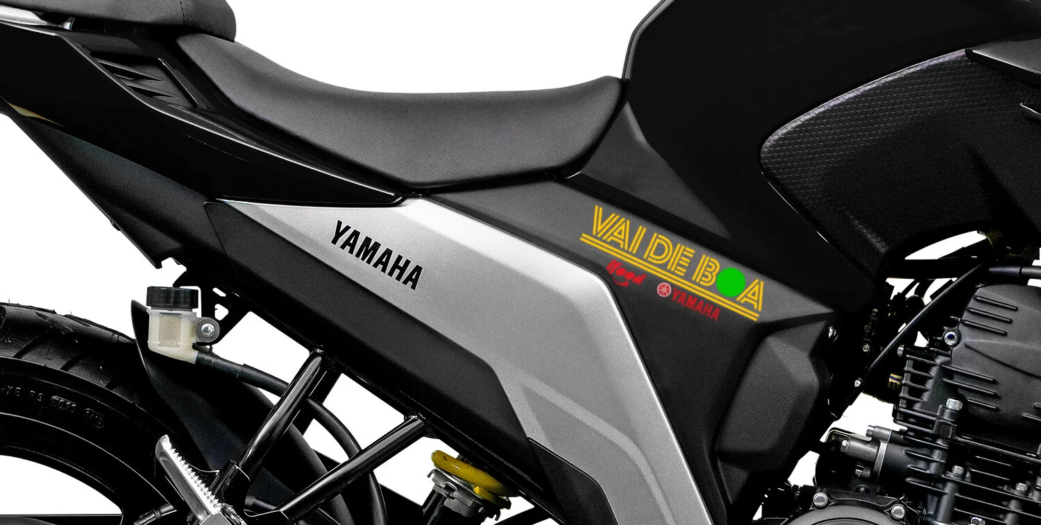
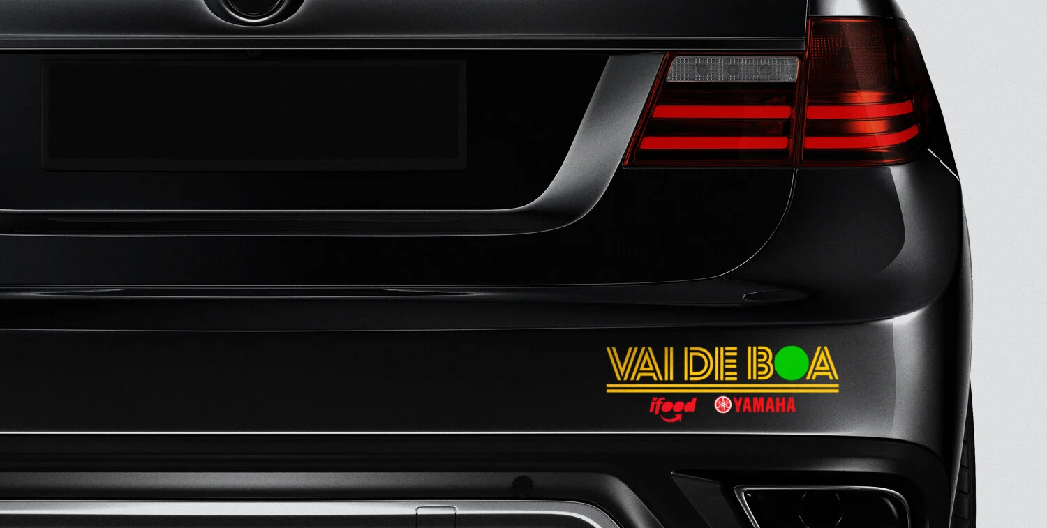
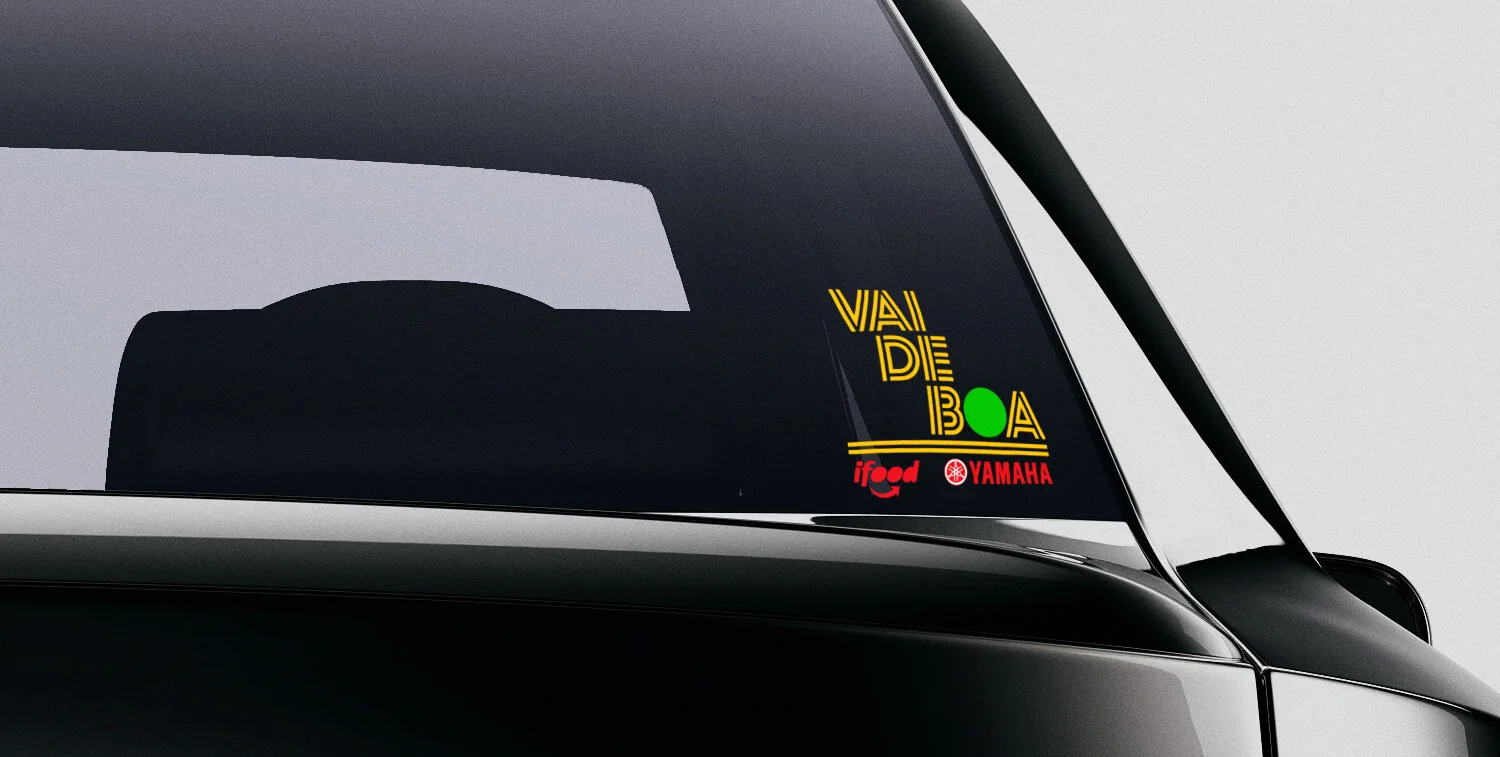
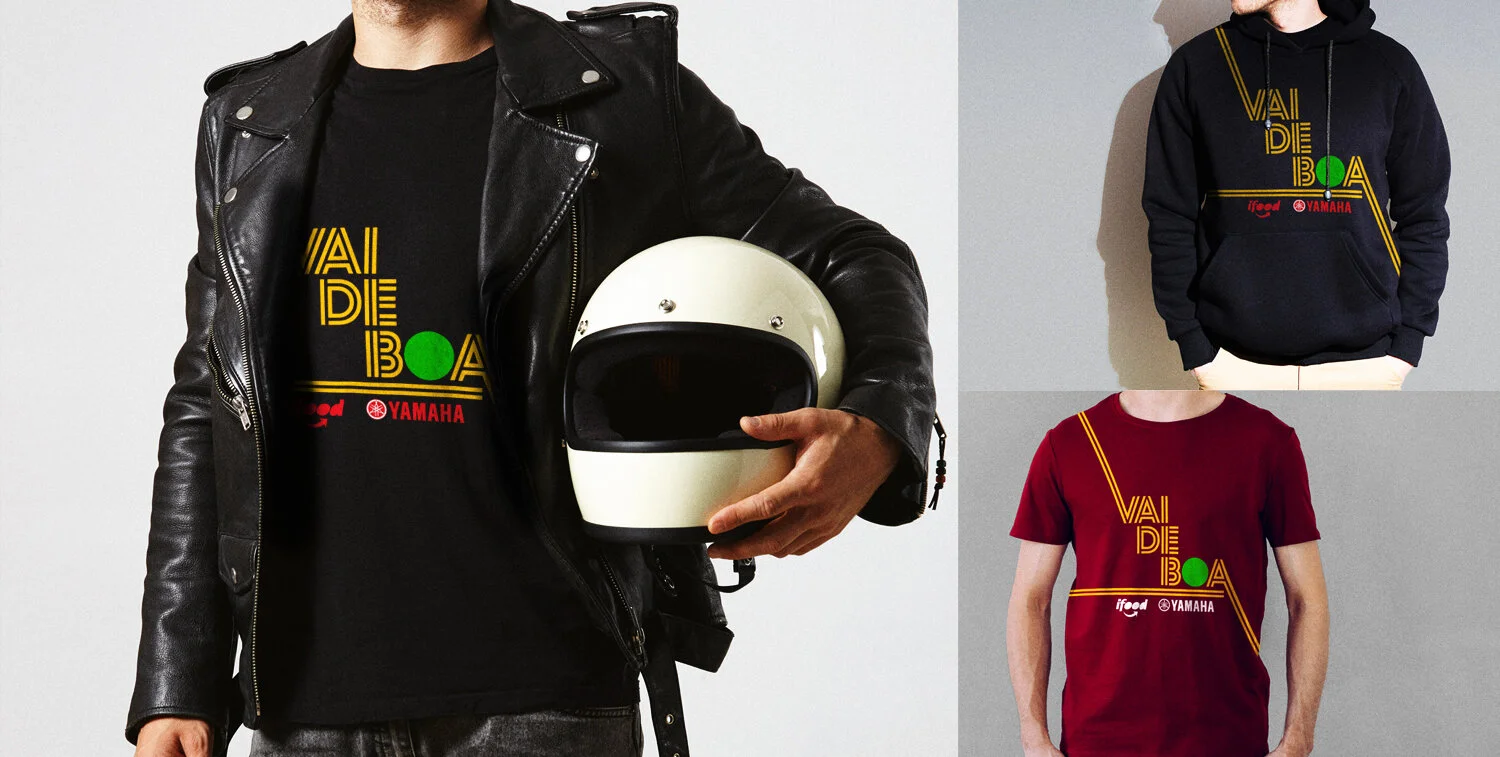
Named "Vai de Boa" (slang for "Take it Easy"), the logo was designed with an exclusive and proprietary typograhy. It was inspired by the 2 continuous tracks of the road, which represent stretches where drivers must be more attentive and not overtake others.
I added to these elements the green light - so the logo's color palette is: first yellow - “attention”, and then green - “go”.


